
Branding & Logo Design
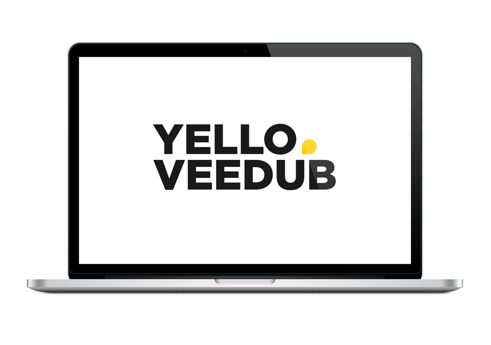
Yello Veedub Ltd

Formerly known as Apexhub Ltd, the brief was to re-brand in conjunction with the new company direction.
The story behind the name of the brand stems from our CEO’s first car. It was a yellow Volkswagen Beetle. Hence the abbreviation ‘Yello veedub’…
We tried many concepts including using the face of a VW Beetle. But we decided this was too literal and also could confuse the potential customer into thinking we were a used VW Beetle parts specialist.
We finally decided the optimal design should be something that is an abbreviation of the name and that can also be used as a brandmark. After many designs, I finally stumbled on a way of merging the ‘Y’ and ‘V’ in a manner that remained within the brand font ‘Gotham’.

Once we had established the stamp we started testing different shades of yellow. Deciding on a yellow which was optimally contrasted on either white or black.

Next came the icon/favicon. This was taken from the negative shape that is within the ‘D’ in the abbreviated logo. This shape also signifies a pin, so that we put the client on the map and that (as a marketing agency) it exhibits growth from the point outwards.


Other Branding Examples


